
Create your own Wilcom .ESA font with Font Creator
Font Creator Element
Creating your own font with Font Creator is one of the most satisfying digitizing experiences. To be able to craft a font which is unique or maybe a true type font that just does not stitch well, is a real achievement of which you can be proud.
Once the font has been created you can:
- Apply any Embroidery Studio baseline to your lettering.
- Create User Refined Letters
- Apply Auto Kerning
- Change the letters size
- And much more
You will require a template to work from to create the shapes that will become the complete font.
I suggest you put together the complete set of letters, numbers and punctuation that you require and have them on long common baseline.
Part of the digitizing process is to establish the baseline for each letter so it is important that you are accurate with this or you will find in the completed font the letters will not line up nicely.

This template could come from the next a screen capture of from a current TTF on your computer.
I find it useful to adjust the size of the image to the preferred height of the font you are digitizing.
All esa files can be resized in EmbrodieryStudio, once they have been created. Bear this in mind when you are creating your font.
Some of the restrictions could be, if the letter height is too small then the column width will be so narrow to stitch, this would be a lower limitation. If the column width becomes too wide for a satin stitch when the letter is enlarged this would be a maximum size limitation.
These restrictions are particularly noticeable with serif fonts and some script styles.
Once you have your template letters on the work area insert guidelines where necessary to help you keep the lettering at constant level.
Remember vertical strokes will push out to be longer than they appear on the screen when stitched and curves will pull in, so make adjustments to the shape to allow for this.
In the image below notice who the curves on the O and C are higher and lower than the ends of the H, it is anticipated that the C’s and O’s will pull in and the columns of the H will push out and if the adjustment is corrent then all should line up.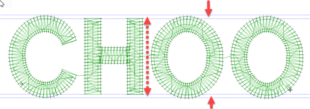
Of course this is an art and not a science the amount of pull and push will be affected by the fabric the lettering is to be stitched on, so aim for a bood average. When I insert the guidelines I guestimate by eye but usually separate the two by about .4 or .5 mm or roughly the stitch density setting.
I prefer to use the Column A tool when creating the shapes but Column B will do just as well, not they are both coumn tools.
When creating the shapes the conversion to a font will use the branching technology so digitize in the order you want the letter to appear. In the case of the letter H
- Cross bar
- left column
- right colum
This way the ends of the horizontal column will be hidden under the vertical columns.
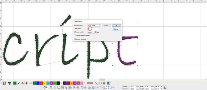
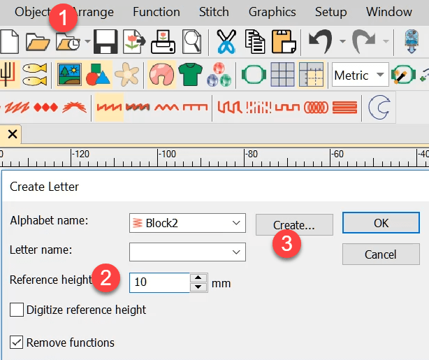
After creating the shapes to make the letter select the objects and from the OBJECT MENU select Create a letter, the first dialog box gives you an opportunity to create a new Alphabet, insert the height of the capital letters in the font you are to create at “2”.
the third box give the fonta a name and spacing value. If the letter height is 10 mm then 10% of height would be 1 mm, you may vary this setting based on the style of the font.
Finally choose the default join type which typically would be closest join.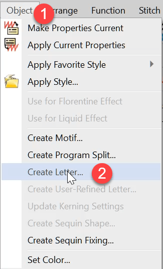
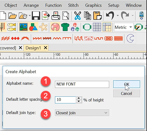
Once the font has been created you can begin adding letters to the font set.
Give the letter a name and okay.
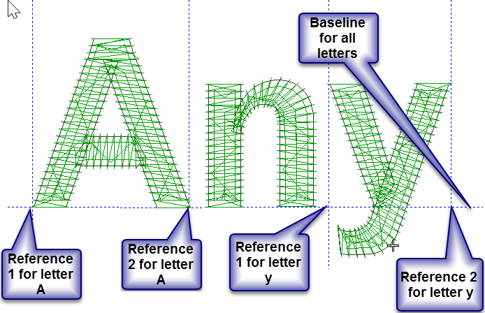
There is one final step to create the letter, the prompt bar is asking for a reference line for the letter.
to do this make one left click at the bottom left of the letter and another exactly horizontally to the bottom right.
These two clicks MUST BE ON THE BASELINE, which mayy or may not be at the bottom of the letter.
Consider the lower case letters y and g where the tail of the letters is below the baseline.
The main point here is that the line of the baseline is consistent for every character created.
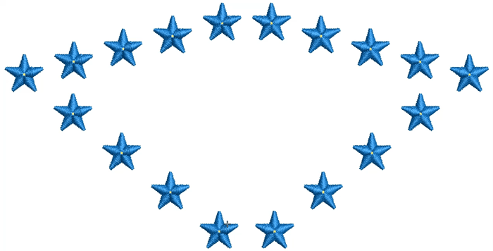
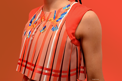
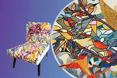
Consider making your own fonts with symbols. In this example, I’ve used the Anyshape line and I have allotted different colors to the letters. 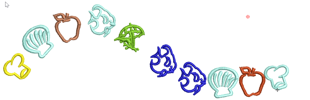
Ask about the world's
favorite embroidery software!

Got questions? We’re here to help.
Contact us