






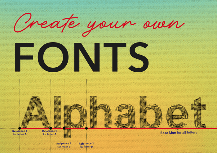
How to Create Your Own Font
Table of Contents
- Step 1: Build a Complete Letter Template
- Step 2: Size the Template Before You Digitize
- Step 3: Add Guidelines and Confirm the Baseline
- Step 4: Compensate for Push and Pull
- Step 5: Digitize Each Letter with the Column A Tool
- Step 6: Create Your Own Font and Alphabet
- Step 7: Start To Create Your ESA Font Set
- Step 8: Repeat for the Full Character Set
- Step 9: Test and Refine
- Optional: Building a Symbol or Decorative Font
- The Font Creator is an add-on feature for EmbroideryStudio Designing. It's included with the Designing SUBSCRIPTION Plan
- See how easy it is to create your own font in Wilcom
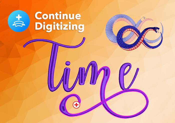
Have you ever wanted to create your own font for EmbroideryStudio? It's easier than you might think. In this blog and video, we'll take you step by step through creating an ESA font using Wilcom's Font Creator tool.
ESA stands for Embroidery Specific Alphabet. Like EMB files, ESA fonts are object-based, so each letter remains fully editable and resizable. Create your own font to save as an alphabet that you can use again and again, just like any other font in EmbroideryStudio.
That's what makes Font Creator so useful: it lets you turn custom lettering into a reusable embroidery alphabet, linked directly to your keyboard. Reproduce a customer's logo lettering, recreate a particular lettering style, or build custom fonts to sell as an extra source of income.
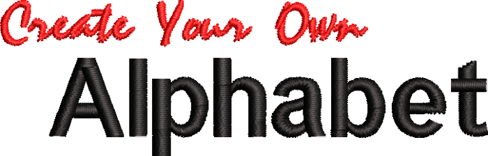
The new alphabet will be stored in your software’s Font Library. You can use EmbroideryStudio's Lettering Baselines and Lettering Art to reshape and transform your custom lettering—opening up even more creative possibilities.

Don't have Font Creator?
You can try EmbroideryStudio 2026 free for 14 days, with every feature unlocked, including Font Creator.
Even if you're running older Wilcom software, you can still trial the latest release.
Ready to get started? Here's how, step by step.
Step 1: Build a Complete Letter Template
Before you create your own font and digitize anything, assemble a template of every character the finished font will need — the full set of capital and lowercase letters, numbers, and punctuation — arranged along one long, common baseline.

- Source the template. Use either a screen capture of an existing font, or a current TTF (TrueType) font already installed on your computer, as the reference outline for each character.
- Lay out every character on a single common baseline. This is what you will trace or digitize from, so treat it as the master reference for the whole alphabet.
Note: Establishing the baseline accurately at this stage is one of the most important parts of the whole process. If the baseline is inconsistent across your template, the letters in the finished font will not line up nicely once stitched.
Step 2: Size the Template Before You Digitize
Adjust the size of the template image to the preferred height of the font you are digitizing, and keep the following stitch-out constraints in mind before you commit to a size.
- Set the template to your target capital-letter height. This becomes the working height you digitize at.
- Remember that you can resize a finished ESA font later in EmbroideryStudio, but resizing changes column widths, so choose a size that fits the range you'll realistically use.
- Check for a lower size limit. If the letter height is too small, the satin column width becomes too narrow to stitch cleanly. (Standard minimum height for an embroidered letter is 4mm).
- Check for an upper size limit (minimum height 4mm). If the letter is enlarged too far, the column width becomes too wide for a satin stitch to hold its shape.
Note: These upper and lower size limitations are especially noticeable in serif fonts and some script styles, so allow extra margin for those styles.
Step 3: Add Guidelines and Confirm the Baseline
Once your template letters are placed on the work area, insert guidelines to help keep every character sitting at a constant, consistent level before you start digitizing shapes.
- Insert horizontal guidelines across the template at the baseline and cap-height positions.
- Use these guidelines as a constant reference as you work through each letter, rather than judging alignment by eye letter-by-letter.
Note: Remember the Push and Pull Compensation rules - Vertical strokes will push out to be longer than they appear on the screen when stitched, and curves will pull in. Make adjustments to the lettering shape to allow for this.
Step 4: Compensate for Push and Pull
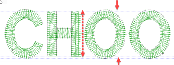
Stitching distorts shapes in predictable ways, so the digitized outline needs to be adjusted before stitching to compensate — not stitched exactly to the template outline. See the ‘CHOO’ as an example
- Expect vertical strokes (such as the columns of an H) to push out and appear longer once stitched than they do on screen.
- Expect curves (such as an O or a C) to pull in and appear shorter—or tighter—once stitched than they do on screen.
- Adjust the digitized shapes to compensate: draw the curved tops and bottoms of letters like O and C slightly higher and lower than the flat ends of straight-sided letters like H. Because the O and C are expected to pull in, and the H's columns are expected to push out, a correctly compensated set will land level once stitched, even though it looks slightly uneven on screen before stitching.
Note: Push and pull compensation is an art, not a science. The amount of distortion depends on the fabric the design will ultimately be stitched on, so aim for a good average rather than a precise figure.
Tip: As a starting guide, add an extra guideline for the inner and outer edge of the compensation. Wilcom suggests starting with about 0.4–0.5 mm, or by an amount similar to your stitch density setting, and adjust by eye from there.
Step 5: Digitize Each Letter with the Column A Tool
Digitize the shapes for each character using a column-type digitizing tool.
- Use the Column A tool by preference, though Column B will work just as well — both are column tools and produce a satin-style column shape.
- Digitize the shapes in the order you want them to stitch, since the font-creation process uses branching technology that follows your digitizing order.
- For a letter such as H, digitize in this order: (1) the cross bar, (2) the left column, (3) the right column.
Note: Digitizing the cross bar first and the two verticals afterward means the vertical columns are stitched over the top of the cross bar's ends, hiding them neatly underneath — rather than leaving a visible joint.
Step 6: Create Your Own Font and Alphabet
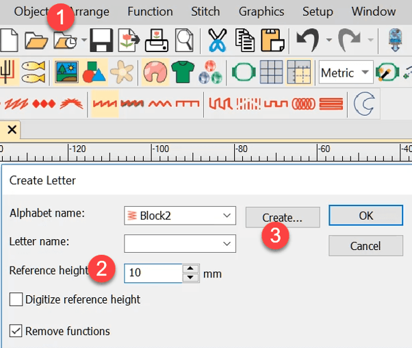
Once the shapes for a letter are digitized, select all the objects that make up that letter and, from the 'Object' menu, choose 'Create a Letter'. This opens a short series of dialog boxes. The first time you use it, you'll be asked to start a new font.
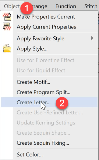
- Click ' Create' from the pop box dialogue box.
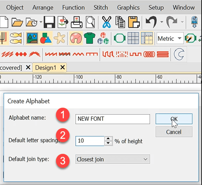
- Name and Spacing: give the font a name, and set a spacing value. As a guide, spacing of around 10% of the letter height is a reasonable starting point (for example, 1 mm of spacing for a 10 mm letter height), though you may want to vary this based on the style of the font.
- Finally, choose the default join type. Closest join is typically the appropriate default choice.
- Click ok
Note: These settings apply to the font as a whole, so decide on them once, when you create the very first letter of a new alphabet.
Step 7: Start To Create Your ESA Font Set
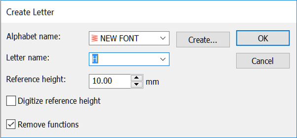
With the alphabet name created, you can begin adding the individual letters to the font set.
- The letter you have started with will be the first to be created.
- Give the letter a name (for example, the character it represents) and select OK.
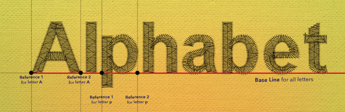
- When prompted for the letter's reference line, click once at the bottom left of the letter, then click a second time exactly horizontally across from it, at the bottom right.
Note: Both of these clicks must land on the baseline — which may not be the same as the visual bottom of the letter. For example, the descenders on lowercase y and g extend below the baseline, so the reference-line clicks still go on the baseline itself, not on the lowest point of the tail. The single most important requirement here is consistency: the baseline must be at the same height for every character you create, so that all characters line up correctly once the font is complete.
Step 8: Repeat for the Full Character Set
Repeat Step 7 for every character — each letter, number, and punctuation mark in your template — digitizing the shapes in your chosen stitch order, adding each one to the same alphabet, naming it, and placing its baseline reference line consistently. Remember to click once at the bottom left of the letter, then click a second time exactly horizontally across from it, at the bottom right.
Step 9: Test and Refine
Once the character set is complete, stitch out a sample of text at a few different sizes and on the type of fabric the font is intended for.
- Check that letters sit level against one another, and that push/pull compensation is holding up as expected on real fabric.
- Check the smallest and largest sizes you expect the font to be used at, confirming column widths still stitch cleanly at both ends of that range.
- Revisit the compensation on individual letters (particularly curved letters, and any serif or script details) if anything looks uneven; edit and re-save the font.
Optional: Building a Symbol or Decorative Font
The same process can be used to create your own font of symbols or decorative shapes rather than standard letters. For example, you can digitize a set of shapes. Then use, the same Create a Letter workflow — alphabet setup, naming, spacing, join type, and baseline reference lines — applies in exactly the same way.
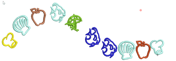
Tip: Once you create your own font, then you are able to use the Any shape baseline and assign a different color to each symbol for a fun, flowy embroidery design.
The Font Creator is an add-on feature for EmbroideryStudio Designing. It's included with the Designing SUBSCRIPTION Plan
available as a separate paid purchase for Designing Perpetual licenses

Create your own font, and use all Wilcom lettering capabilities.
Features such as Lettering Art are easy to apply. See the word TYPHOONS in this logo
Font Creator Element
Valued at US $999*
(*excludes tax)
Don't have Font Creator? You can try EmbroideryStudio 2026 free for 14 days, with every feature unlocked, including Font Creator.
Even if you're running an older version of Wilcom software, you can still trial the latest release.
See how easy it is to create your own font in Wilcom
Ask about the world's
favorite embroidery software!

Got questions? We’re here to help.
Contact us